Combining Text and Images to Improve Visual Design and Communication
Studies continue to show that humans can better absorb information visually over just text; an important fact to consider the next time you create your next piece of content be it a Presentation, Infographic or rich graphics.
In order to create a well balanced design, you want to achieve a good relationship between text and images to support it. In this article, we're going to give you 4 easy to follow tips that will help you to more easily combine text and images.
01. Consider composition
Via Dribbble. Design by Vedad Siljak.
The placement and arrangement of your text in relation to your image can make or break a design. If the text is too small, the background too busy or distracting, or anything else is compromising readability, your design won’t be as effective or visually appealing.
But the text is only one half of the equation; how the image appears in your design is just as important. So you’ll also want to pay attention to both of the following:
1. Image composition
Whether you’ll be taking a photo yourself or sourcing one to use in your design, you’ll want to make sure that it leaves a good, clear space to place your text (unless you want to add a design element that sets off the text and/or disguises a detailed background, like a shape or screen — more on that later).
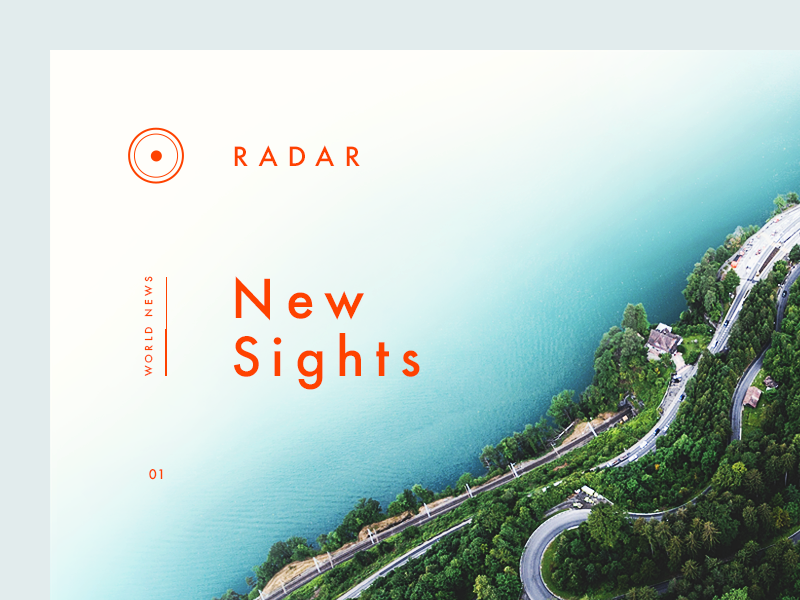
Use negative space
One of the most powerful and often overlooked elements in design is white space, also known as negative space. White space doesn't necessarily have to be white; it's the empty space around and between elements in a design.
Purpose: White space isn't wasted space; it serves a purpose. It helps guide the viewer's eye, improves readability, and creates a sense of balance and harmony in your design.
Visual Clutter: Avoid overcrowding your design with too many elements. Adequate white space allows the viewer to focus on the essential elements without feeling overwhelmed.
Hierarchy: White space can be used to establish hierarchy in your design. By adding more white space around a key element, you draw attention to it and emphasize its importance.
Legibility: Whether it's a poster, website, or any other design, white space plays a crucial role in ensuring text is readable. Don't be afraid to give your text some breathing room.
Aesthetic Appeal: White space contributes to the overall aesthetics of your design. It can make your work look more sophisticated, modern, and visually pleasing.
Remember, effective design is not just about what you include; it's also about what you leave out. Embrace white space thoughtfully to enhance the impact and effectiveness of your designs.
2. Text position
A design is more than the sum of its parts. You can have an attractive image and an effective message set in a nice typeface, but unless the two elements flow together well, then the outcome may not attract as much attention or get the kind of results you’re looking for.
Shape your text
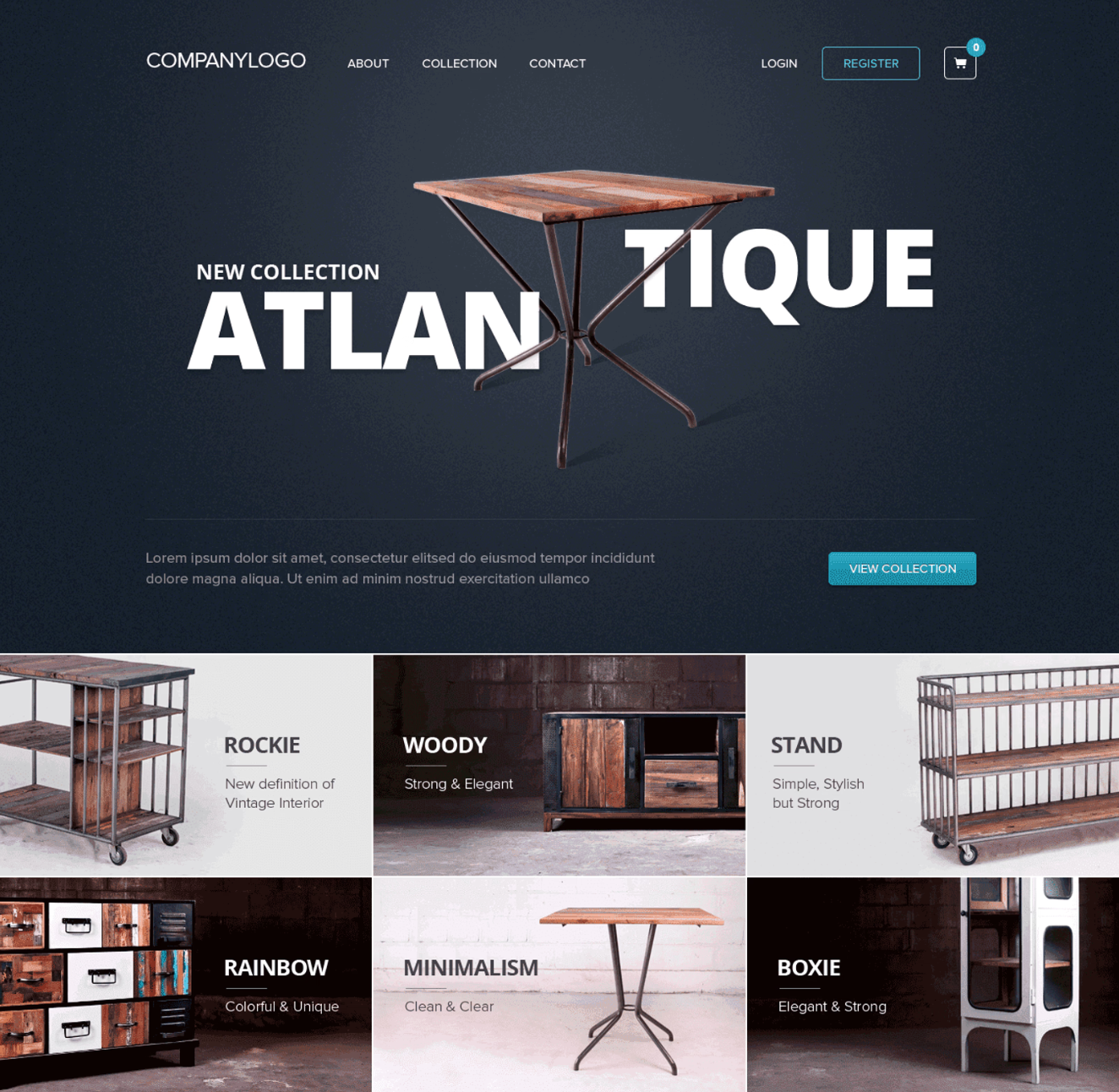
One way to create a composition where the image and text complement each other is to align your text so it fits with a shape present in the image. Notice how the header of this website layout takes a creative approach to aligning the text: its placement shows off the design of the product that the image is advertising. This continues in the grid of images below the header, where blocks of text and product photos are equally balanced and set each other off.
Via Dribbble. Design by Dwinawan Hariwijaya.
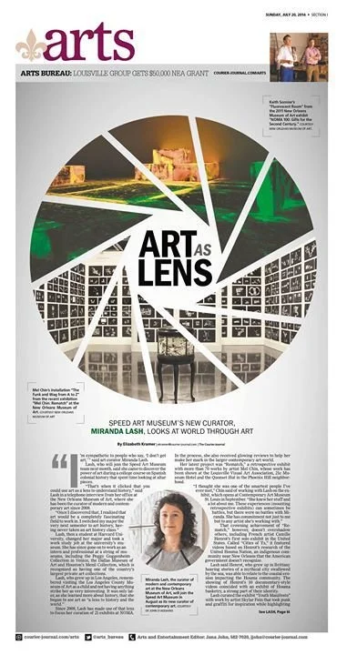
Another way is to think about the composition in broader terms than just an image as a background with text on top. The two can be arranged in endless ways — so let your creativity loose. For instance, the layout below directly connects the topic of the text to the image by cropping photos into a specific, recognizable shape.
And this one features a different kind of cropping, letting the image peek through the letter shapes.
02. Establish a Focal Point
One of the essential elements of a good composition is a focal point — some kind of visual element that catches the eye and serves as a starting point for users to navigate your design. In the context of a layout that involves just imagery and text, it’s going to be one or the other. So you’ll need to decide which one is more important and help it stand out through color, size, position, or another characteristic.
Image as the focus
This design makes the image of a vacation destination the clear center of attention, perhaps an appropriate choice for a travel website. Because of its value (it’s the darkest part of the layout, while everything else is light) and size (it spans the whole width of the page), the image has the most visual weight. However, you don’t want the rest of your design disappearing either. Here, the shapes present in the photo, along with vertical accent lines, help draw your eye back up to the text, where a pop of bright blue gets you focusing there.
Text as the focus
In contrast, the following web page makes text its focal point (with a bold, uppercase typeface at a large point size) and de-emphasizes the image with an overlay of transparent color. However, the text and image have been arranged using a layered effect that connects the two elements and makes for a dynamic composition.
Dual focus
Or perhaps your text and image are equally important and need to visually combine into a cohesive whole. This book cover achieves that effect, literally wrapping the title text around the image of the flower, blending the two together so you look at them at the same time.
03. Achieve Balance
Like a see-saw with a child on one side an adult on the other, designs get unbalanced when there’s a part that’s too heavy — visually heavy, that is.
Organize your elements
We’re not talking about focal points, because visual weight is often what sets them apart from the rest of the design. Instead we’re talking about designs that aren’t organized well. Maybe they’re too busy or cluttered. Maybe all the content has been squeezed onto one side of the layout. Or perhaps the spacing and alignment are off. Any of these problems, and more, could knock your design off balance.
More important in minimalist designs
For a simple design that only features text and an image, like some of the landing pages and book/magazine covers we’ve already looked at, balance becomes especially important: the more minimal the design, the more glaring any poor layout choices will be.
Use space and visual weight
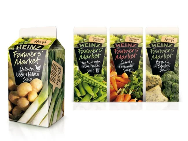
On the packaging below, the brand name is balanced out by the image below it. Both are roughly equally in size and connected by their shared color. As a nice touch, the image itself provides space for more text, which has been put to use to feature the unique name and ingredients of each product in the line.
Adjust text position
And this design achieves balance simply through the position of the text on the photo. If the text had been aligned to the right side of the image instead, the layout’s dual focal points (the silhouetted figure in the photo and the white text) would have been grouped together, leaving a big empty space on the left — and creating an off-kilter composition. As it is now, the two sides have equal visual weight, so the design is balanced.
04. Choose Your Image Wisely
In design projects, imagery plays a bigger role than just producing a pretty background or accent; it can lend context, tone, and emotion to your design. And when those qualities match or support your text, you’ll be communicating to your audience much more clearly. So unless you purposely want some visual contradiction in your design, it’s best if your image complements your text (and vice-versa).
Use imagery to add context
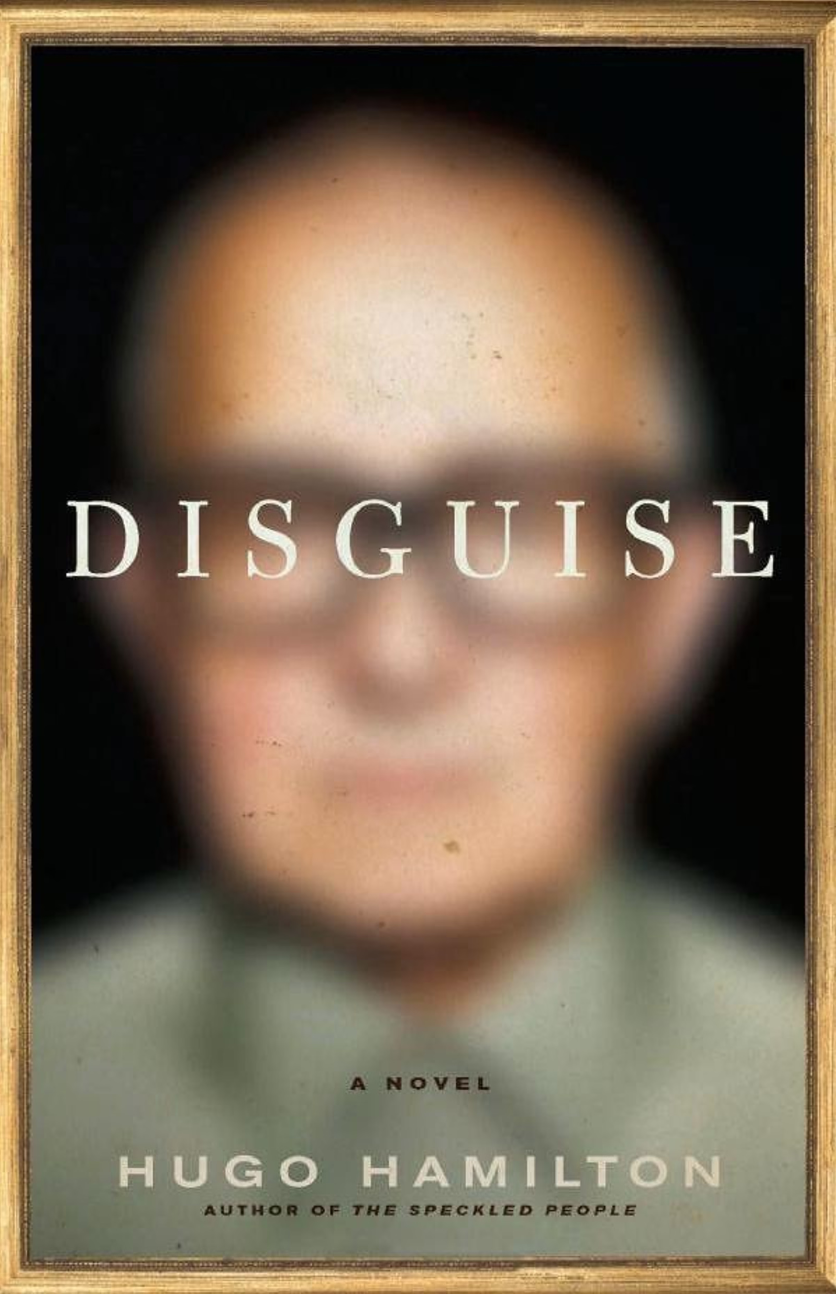
Here’s an interesting example of this concept in action. The blurring of the image and the placement of the text over the man’s eyes both reinforce the idea of disguise, which also happens to be the title of the book. All these design choices work together to create a composition where the relationship between the text and the image is both clear and visually interesting — they flow together seamlessly.
Use visual cues
Take this packaging as another example: what better way to say that your product is fresh and healthy than with colorful photography of crisp vegetables? Plus, the copywriting supports those concepts: “fresh,” “farmers’ market,” “seasonal.” The images and text work together to communicate the same message.
05. Create a Background for Your Text
As mentioned briefly earlier, creating a space for your text where it is easy to see and read is an important step in this process. There are two main ways you can do it.
Choose an image with empty space
This points back to our first tip on composition. Photos that have large, clear areas, blurring or soft focus, or other features that provide a minimally detailed space for the text are the best candidates. That’s because highly detailed or busy images behind text can make the copy difficult, if not impossible, to read.
For example, these social media images have just enough blurring on the background images that the objects are still identifiable, but the typography on top doesn’t get lost.
2. Edit photos and add effects
Let’s say you’ve found the perfect image for your project, but it’s just not suitable for placing text on top. Maybe it doesn’t have any clear spaces, or it has lots of interesting detail. You can still use it, but you’re going to have to put in a little extra effort to help your text stand out. There are a number of ways do can do this.
Adding a background shape
A solid or transparent shape that covers just the portion of the image where the text will be is a common solution.
Adding a transparent color overlay
A transparent block of color that covers the whole image can help minimize it and downplay details, creating a surface for the text that’s more visually uniform.
Lightening or darkening the image
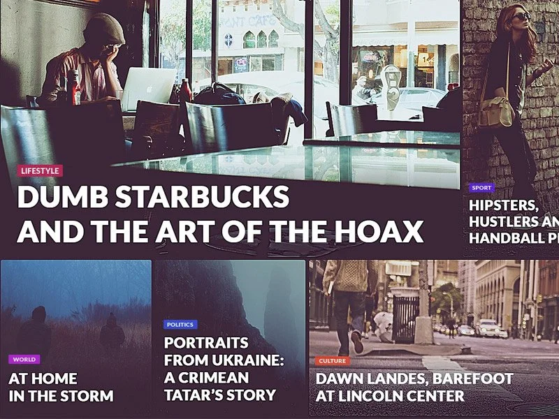
If you’d rather not add extra elements to your layout, then sometimes you can edit the photo itself to help your text stand out. Here, the photos have been darkened to help the white text really pop.
And here, while some of the photos are darker in color and value already, notice how there’s a dark gradient at the bottom of each image, which gives some extra support to the text.
06. Enhance Visibility With Color & Contrast
Once you have an image, you’ll want to make sure that the text pops off the page or screen, especially if you’re not using a background shape or other technique to assist. There are two ways to achieve this.
Use color
There are many approaches you can take when choosing color schemes for your designs. But let’s look at two that specifically relate to pairing text and imagery.
Coordinate your colors
For a look that’s very harmonious and cohesive, you can try pulling colors directly from your image to apply to your text.
Opt for opposites
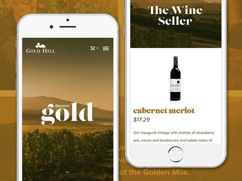
For a more dramatic look, try color combinations with more contrast. The color wheel is a good place to start, with complementary (or opposite) color pairs like blue and orange or purple and yellow, as in the designs below.
Use contrast
You can achieve contrast through color (as seen in the previous example), but also through characteristics like size, shape, position, and more. The postcard design below uses all of these qualities: the salmon pink color contrasts with the cool blues and greens in the photo; the size of the words contrast with each other, as do the letter shapes of the font choices; the slanted, curved orientation of ‘ROAD’ contrasts with the rest of the typography (but follows the slant of the hills in the photo). All of these choices create a visually interesting composition and help the text stand out.


